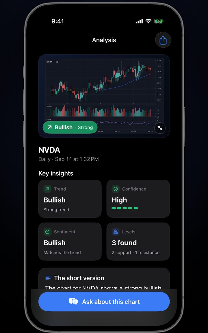
ChartCheck turns a picture of any trading chart into a structured technical read - trend and structure, support and resistance, patterns, your indicators - in about the time it takes to switch apps.
Get ChartCheck on iPhoneEducational analysis only. Not financial advice.
No account setup before you can try it, no connecting a broker, no pasting a ticker. It reads the picture you give it.
TradingView, your broker app, Webull, MetaTrader - whatever you already use. Keep the price axis and the timeframe in frame and you are done.
Trend and structure, the levels that have actually been tested, named patterns, your visible indicators, and a plain-language summary - always in the same order.
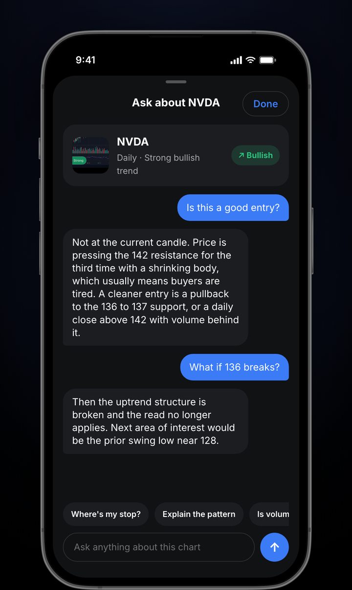
Anything you want clarified about that specific chart, in a thread attached to the read. Tap a suggested question or type your own.
Every analysis comes back in the same shape, so two charts are actually comparable - which is most of what makes a read useful.
The same checklist a technician runs on a first pass, applied identically every time - at 6am, at 11pm, after a winning week and after a losing one.
The sequence of higher highs and higher lows, or lower highs and lower lows, and the exact point where that sequence broke.
The price zones that have actually been tested more than once, described by where they formed rather than a bare number.
Triangles, flags, wedges, head and shoulders, double tops, engulfing candles - named, and marked complete or still forming.
Whatever is visible in the screenshot gets read - RSI, MACD, moving averages, volume - rather than assumed defaults.
How clearly the chart could be read. A clean daily scores high; a cropped, low-resolution capture scores low, and says so.
An explicit list of what was cropped out or unreadable, so you know where the read is thin instead of guessing.
Follow-up questions in a thread tied to that specific analysis, so context carries between questions.
Previous analyses of the same asset stay with it, so you can see how your read of it has changed over time.
Most apps in this category are vague here. Being specific about the limits is more useful than a longer feature list, because you can calibrate around known limits.
You give it a screenshot of a price chart and it reads the picture back to you in a fixed structure: trend and market structure, support and resistance zones, chart and candlestick patterns, whatever indicators are visible, a plain-language summary, and a confidence level describing how clearly the chart could be read.
No. It describes what a chart shows and it is explicitly not financial advice. It does not recommend buying, selling or holding anything, and it makes no claim about what price will do next.
Any market whose chart is legible as an image - stocks, ETFs, crypto, forex and futures all work, because they are all candlesticks on an axis. What matters more than the asset is screenshot quality: the price axis and enough bars for context need to be in frame.
No, and it is a reasonable way to learn, because every term is attached to a chart you were already looking at. That said, being able to evaluate the output matters - if you cannot tell a good read from a confidently wrong one, you are following something you do not understand.
It measures how clearly the chart could be read, not the probability that a trade works. A clean daily chart with a visible price axis scores high; a cropped, low-resolution screenshot scores low. High confidence means the picture was legible, never that price will go up.
Guides on what automated chart reading genuinely does, where it fails, and how to read trend, structure and levels yourself.
Screenshot it, read the structure, ask what you actually want to know.
Get ChartCheck on iPhoneRequires iOS. Subscription required to analyse charts.